SC Real Estate
Suzanne Charnos
Branding
2023
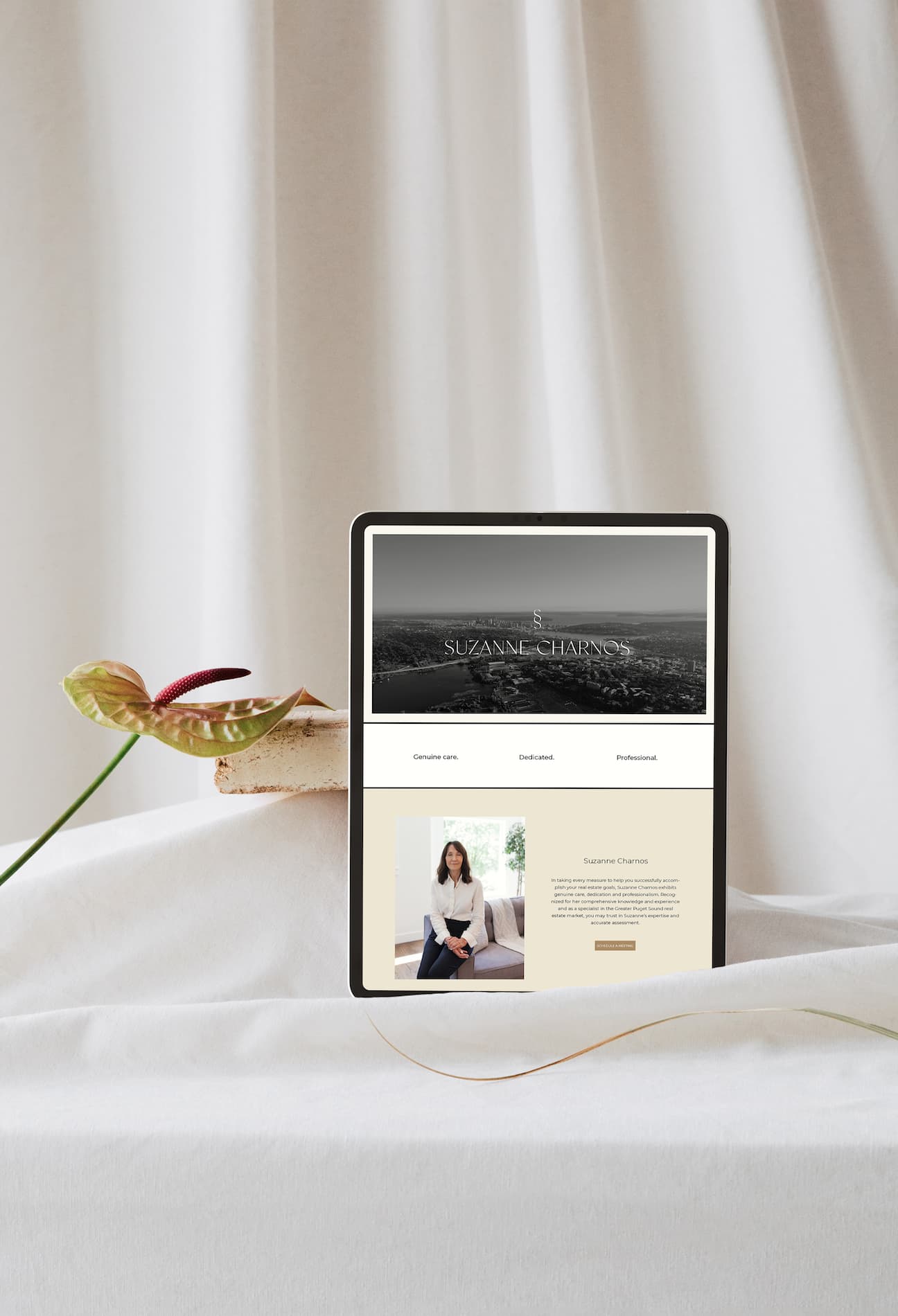
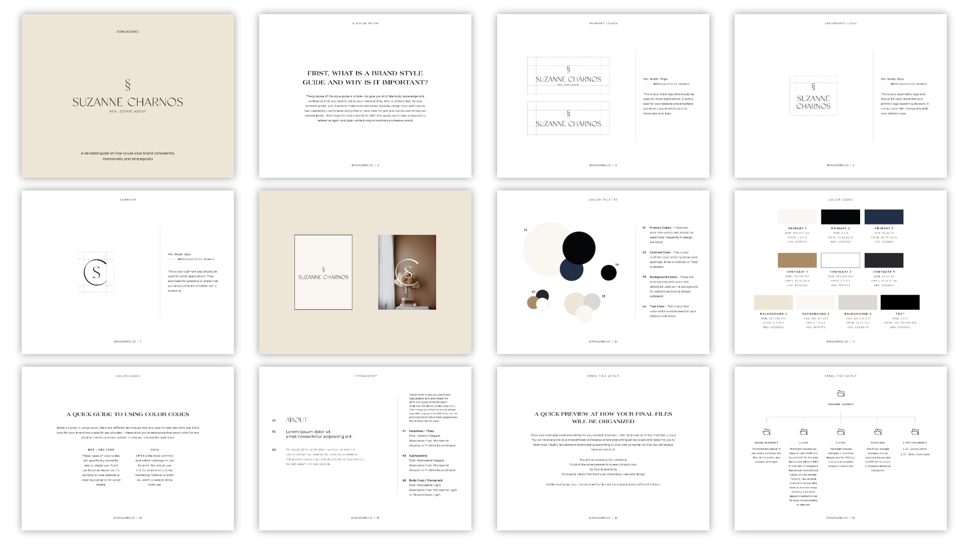
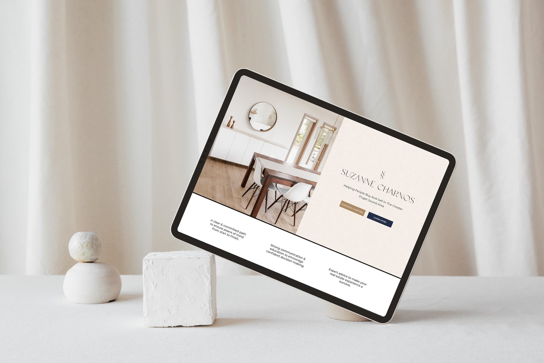
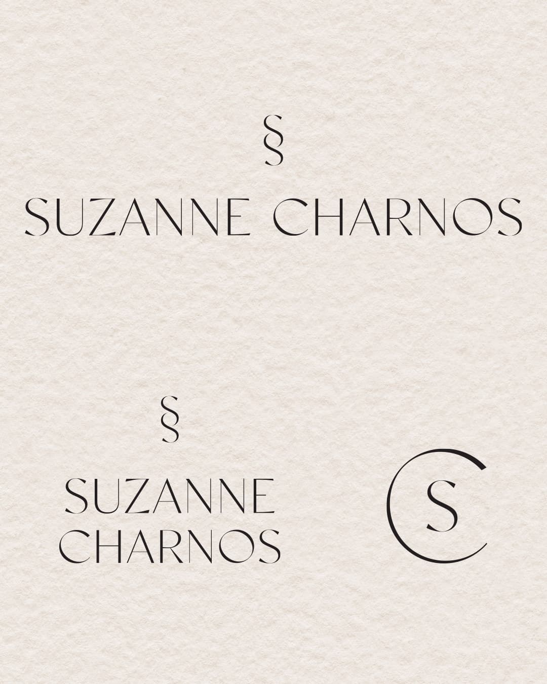
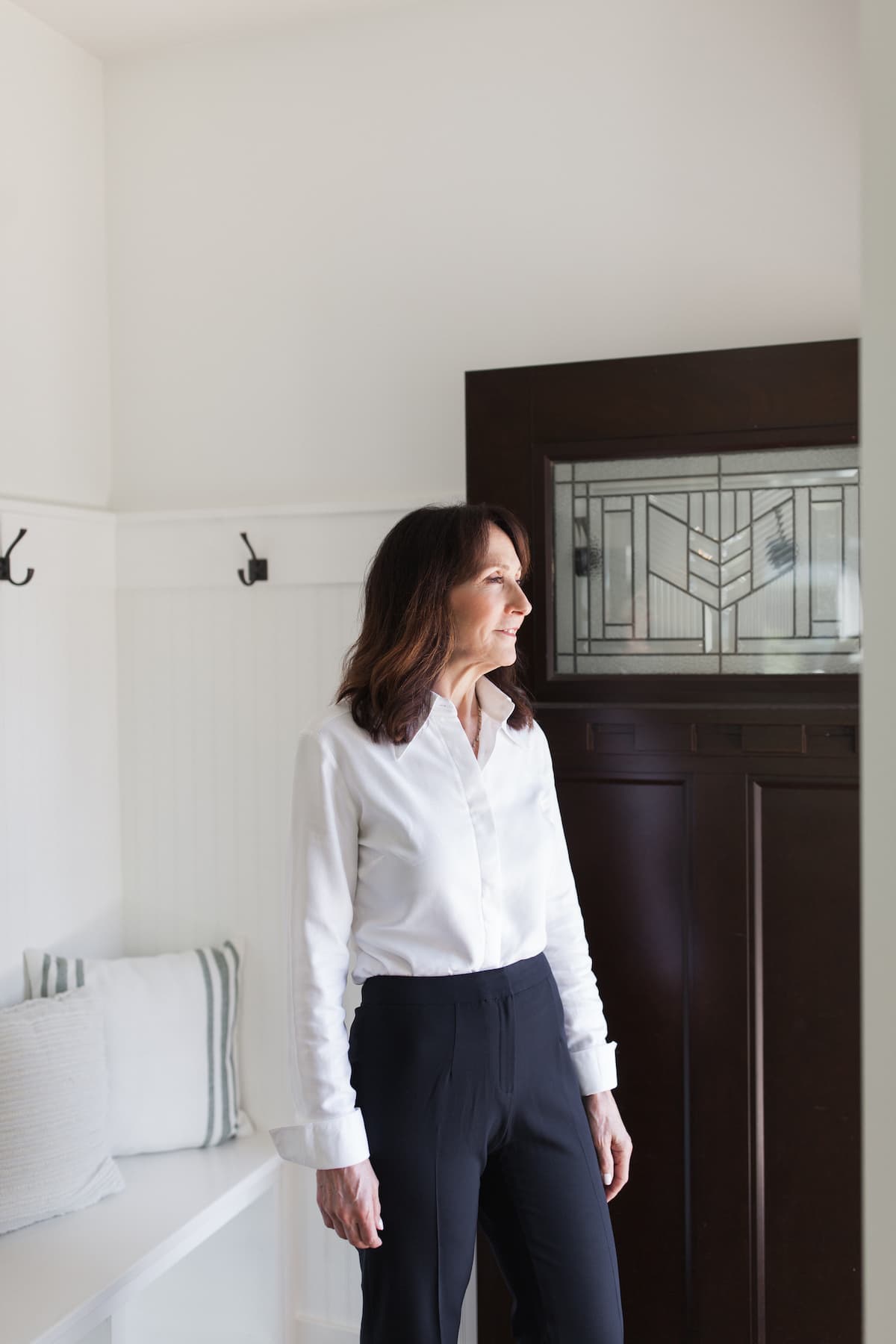
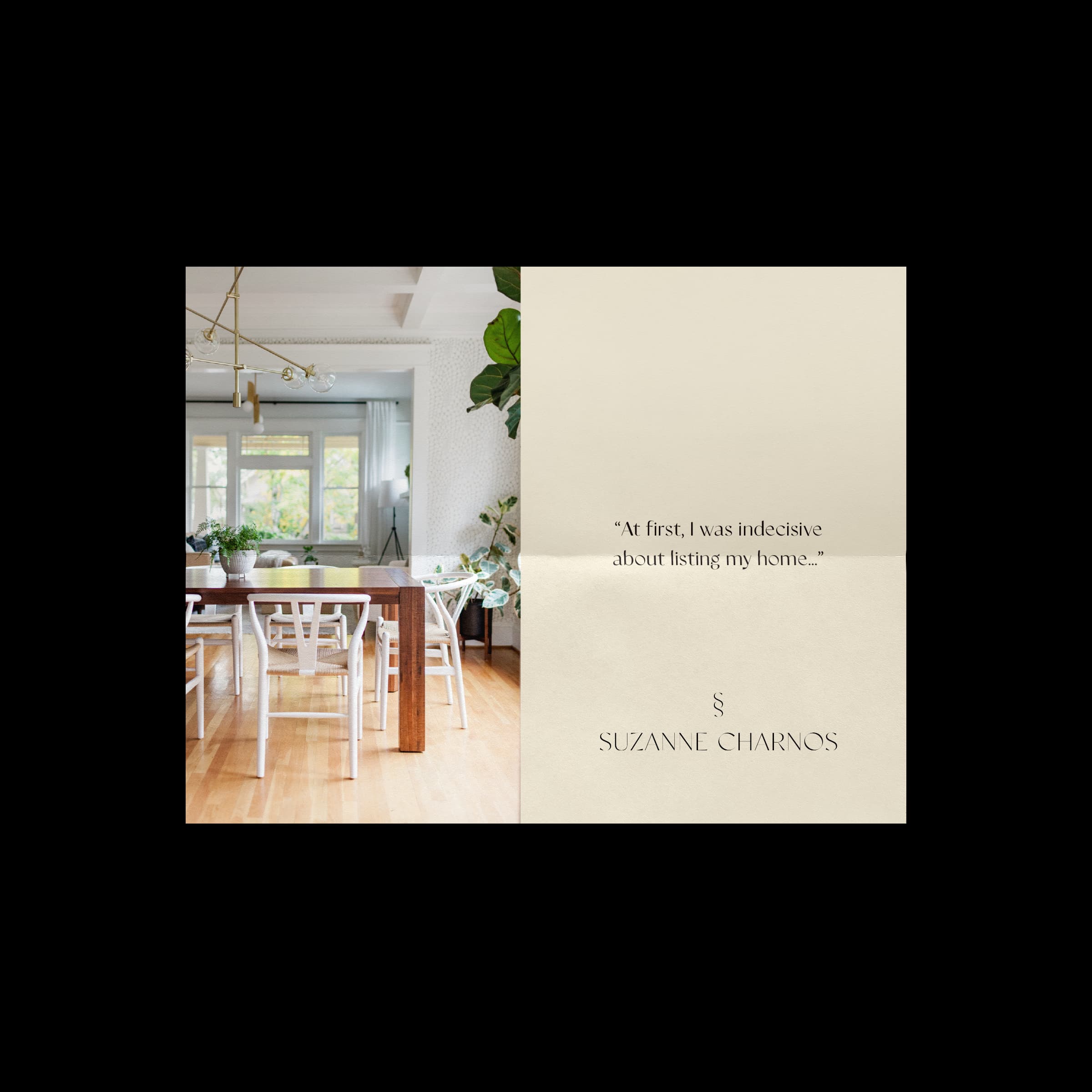
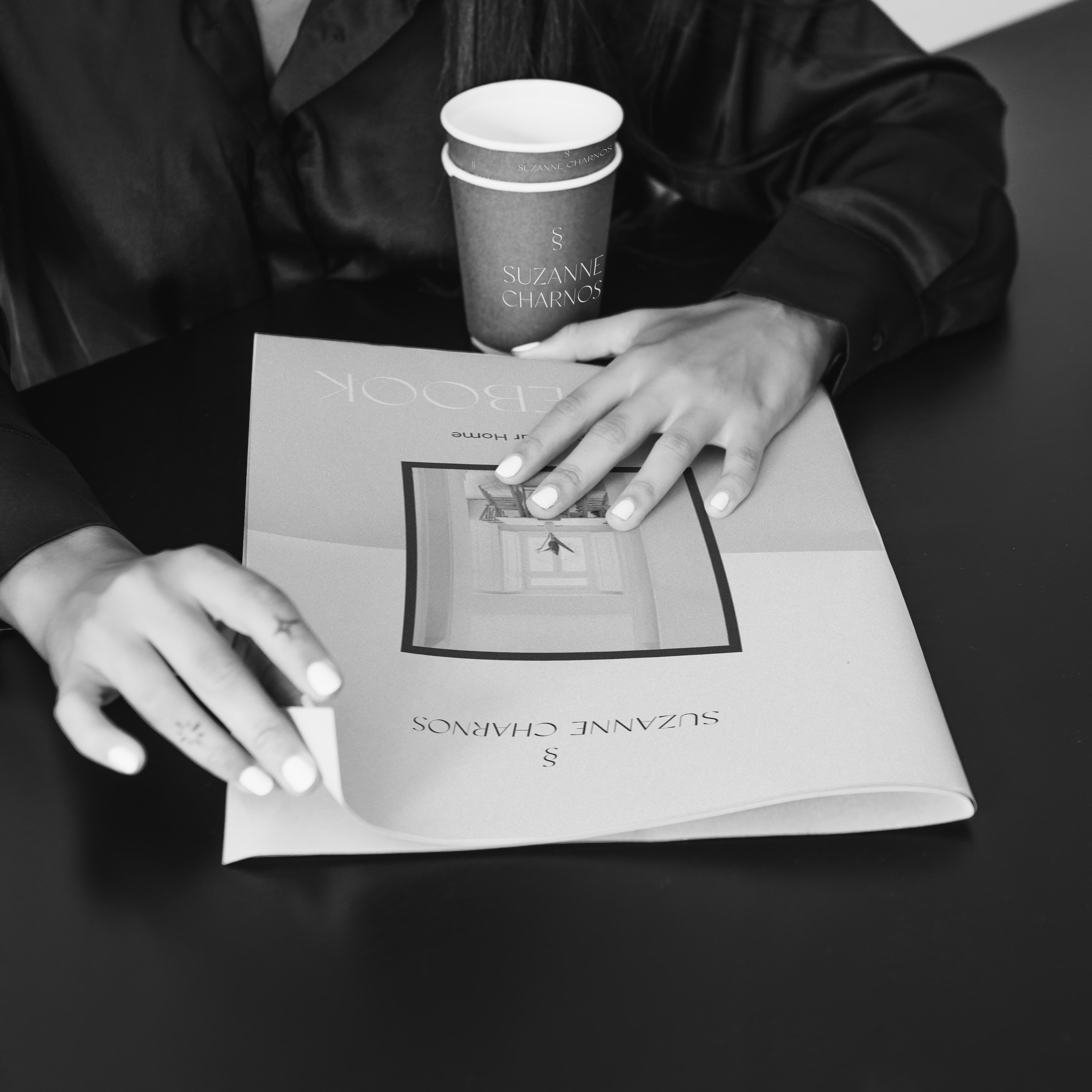
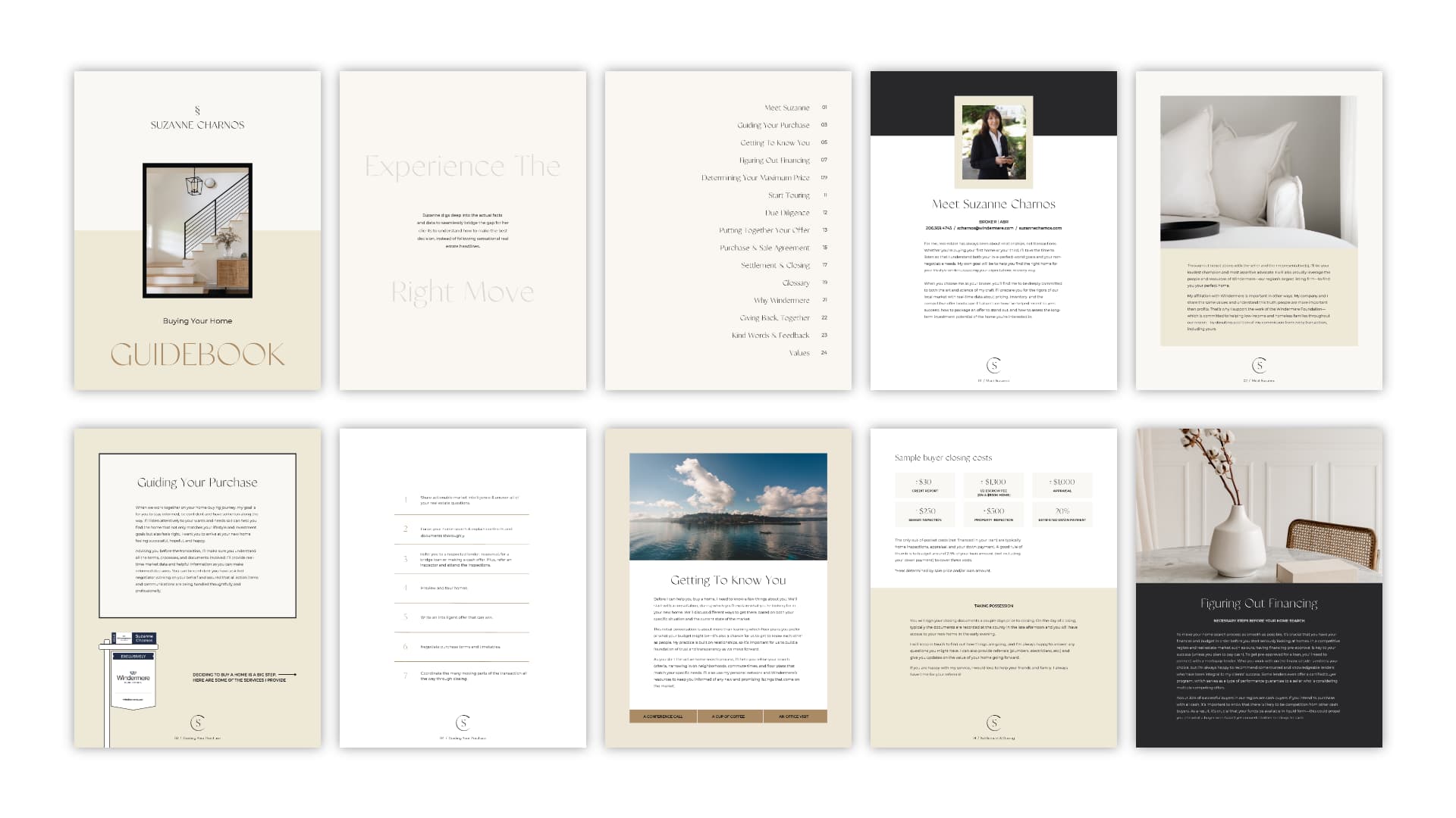
Suzanne Charnos needed a brand that could carry the weight of deep expertise without ever feeling cold or transactional, and the work focused on building an identity as considered and calm as she is. The logo drew from refined serif typography and a double-S monogram that sits with quiet authority, and the palette moved through warm cream, deep navy, and soft gold in a way that feels elevated without trying too hard. The website was built to guide rather than impress, letting her process and her people speak clearly across every scroll. Print extended the identity into buyer and seller guidebooks, listing postcards, and branded collateral that a client could hold and trust before a single conversation began. The headshots were treated as part of the same visual language, shot in natural light inside real homes so that warmth and professionalism arrived together in the same frame, and from that a cohesive presence emerged across every surface where Suzanne shows up.