Bodi
Bodi Skincare
Branding
2024
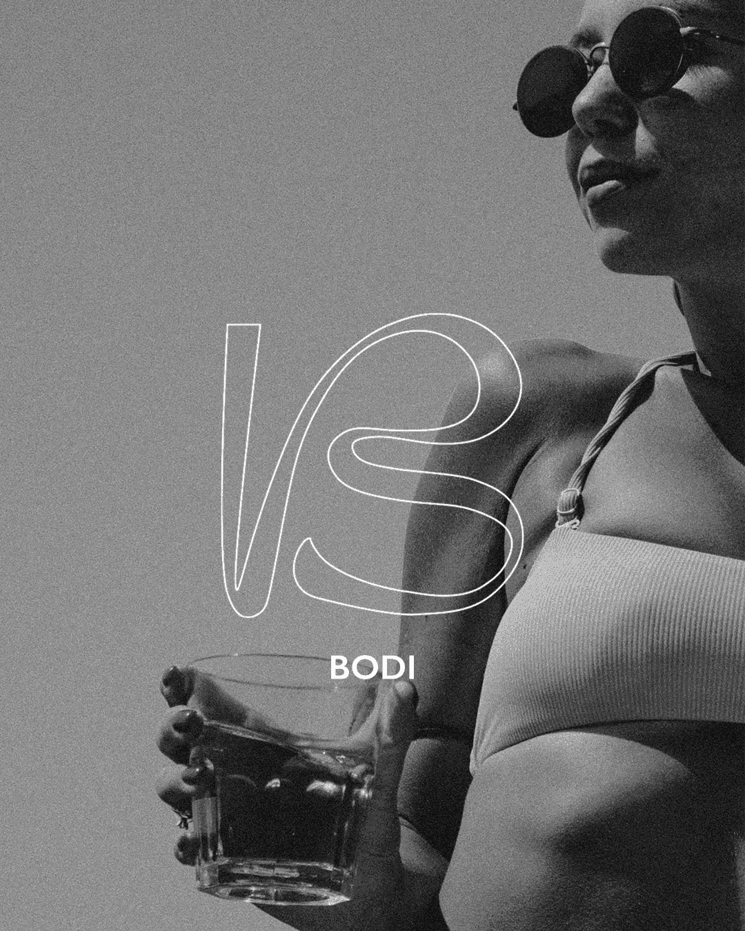
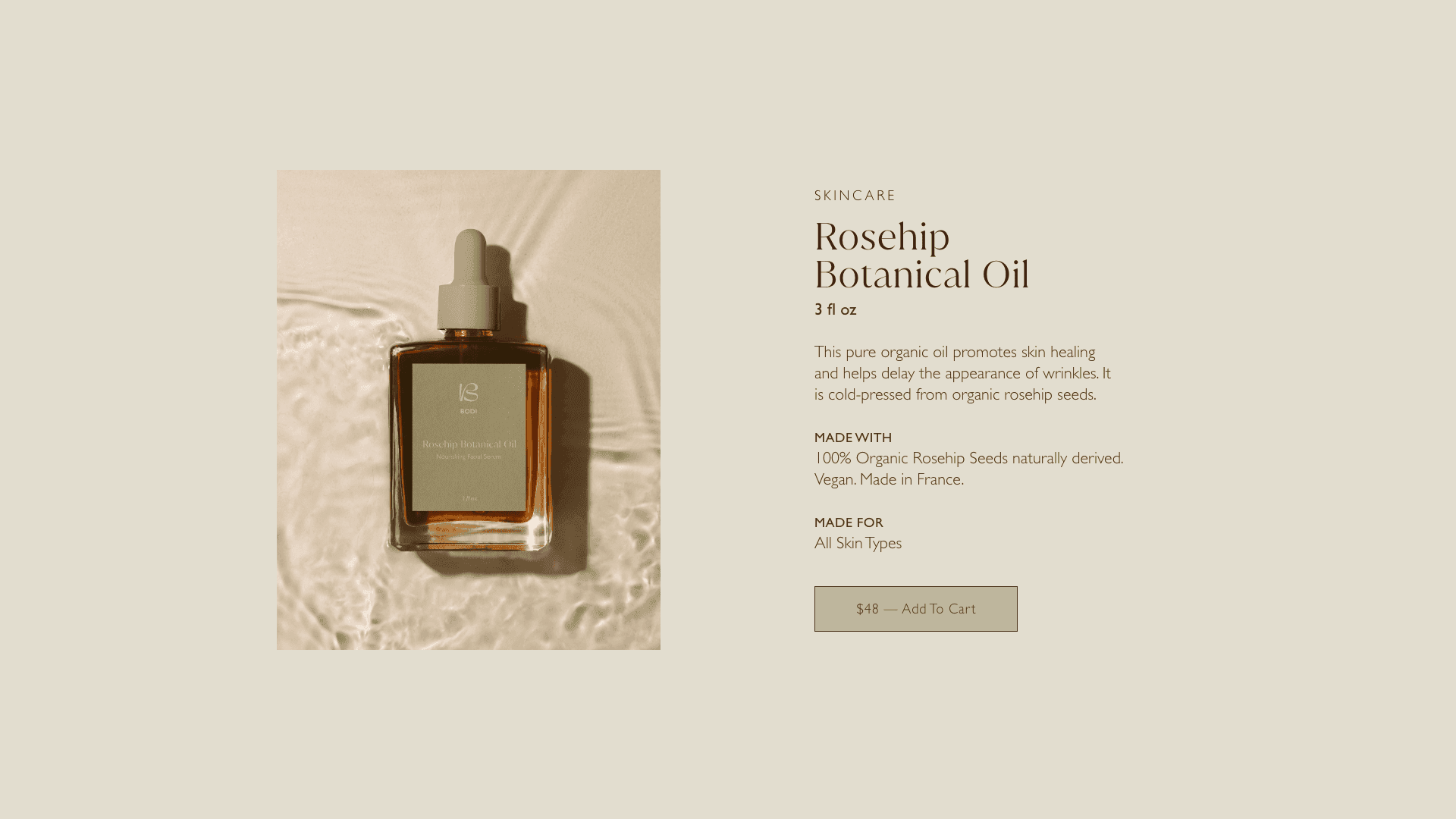
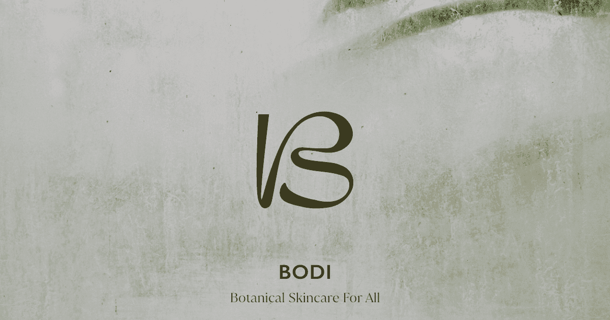
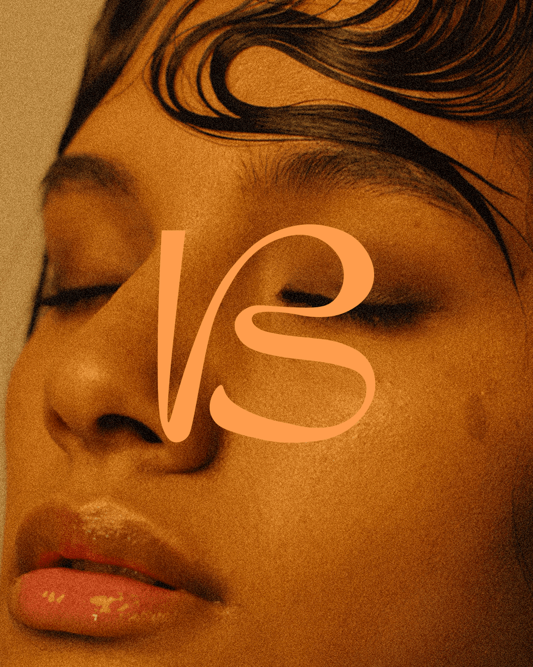
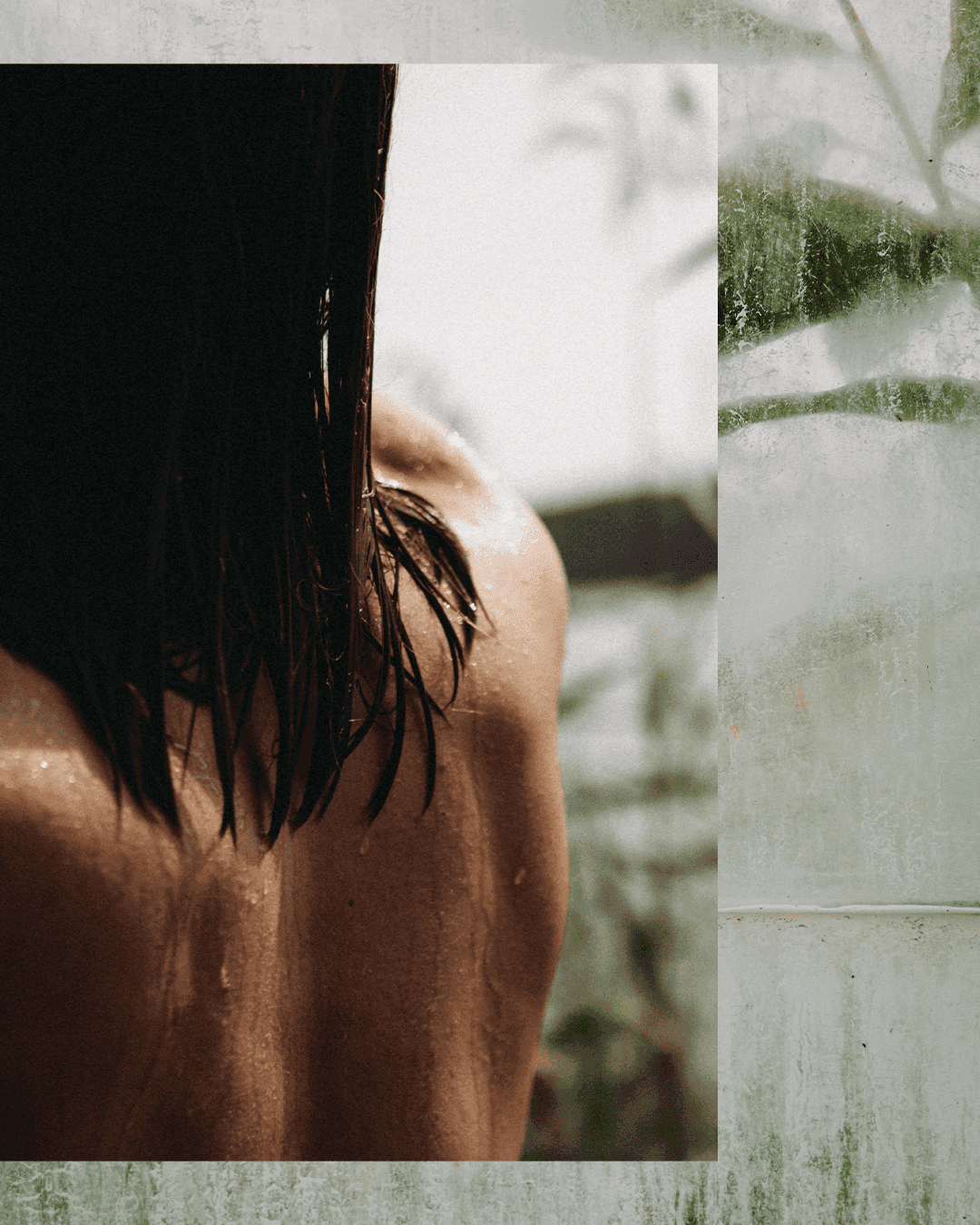
The starting point for Bodi was something small and strange and beautiful, the way hair curls and clings to wet skin in loose swirling shapes that look almost drawn. From that single observation a whole brand identity took shape, built around the tension between body and nature. The logo and visual language leaned into fluid curves and botanical detail with enough refinement to sit in the high-end skincare space without losing its earthy warmth. The packaging and website carried that same feeling across every surface, clean and considered but with a softness underneath that keeps it grounded, a brand that feels like it belongs both in nature and on a shelf.